Currency Mix
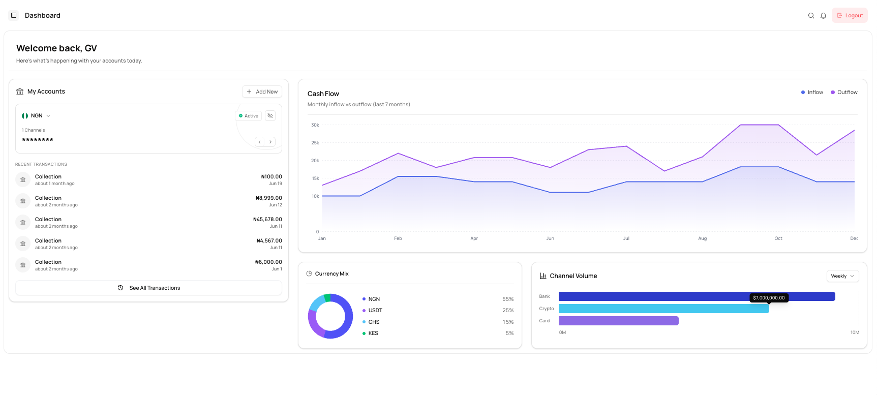
The Currency Mix chart shows the percentage distribution of activity across the currencies available to your business.
Read the chart
Each colour represents a currency, while the percentage shows its share of the total displayed activity.
The dashboard example includes:
- NGN
- USDT
- GHS
- KES
info
The currencies shown on your dashboard depend on the accounts and transaction activity available to your business.
Use the Currency Mix chart
You can use this chart to:
- Identify your most-used currency
- Compare activity across markets
- Understand how your payment activity is distributed
- Monitor changes in currency usage over time
Common issues
A currency is missing
The currency may not be enabled for your business or may not have qualifying activity.
The percentages do not match account balances
The chart may represent transaction activity rather than current wallet balances.
The chart shows only one currency
Your business may currently have activity in only one supported currency.