Cash Flow
The Cash Flow chart compares money received and money sent over time.
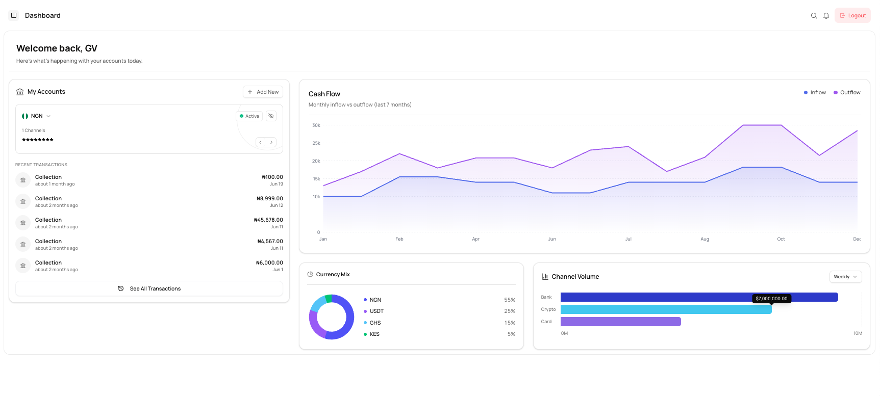
Chart lines
| Line | Meaning |
|---|---|
| Inflow | Money received by the business. |
| Outflow | Money sent or paid out by the business. |
The chart displays monthly values across the period shown on the dashboard.
Read the chart
Use the chart to:
- Compare inflow and outflow trends
- Identify months with higher transaction activity
- Review changes in payment volume
- Monitor whether outflows are increasing faster than inflows
Hover over a point on the chart, where supported, to view the value for that period.
Interpreting changes
A rise in inflow may reflect increased collections or wallet funding.
A rise in outflow may reflect increased payouts or other outgoing transactions.
The Cash Flow chart is an analytical summary. Use the transaction list when you need to review individual transactions.
Common issues
The chart is empty
There may be no qualifying transaction activity for the period shown.
A recent transaction is not reflected
Analytical charts may not immediately show newly processed activity. Review the transaction list for the latest records.
The figures do not match one account
The chart may summarise activity across multiple accounts or currencies available to your business.